I think data visualization can be beautiful. Here are some of my favorites.
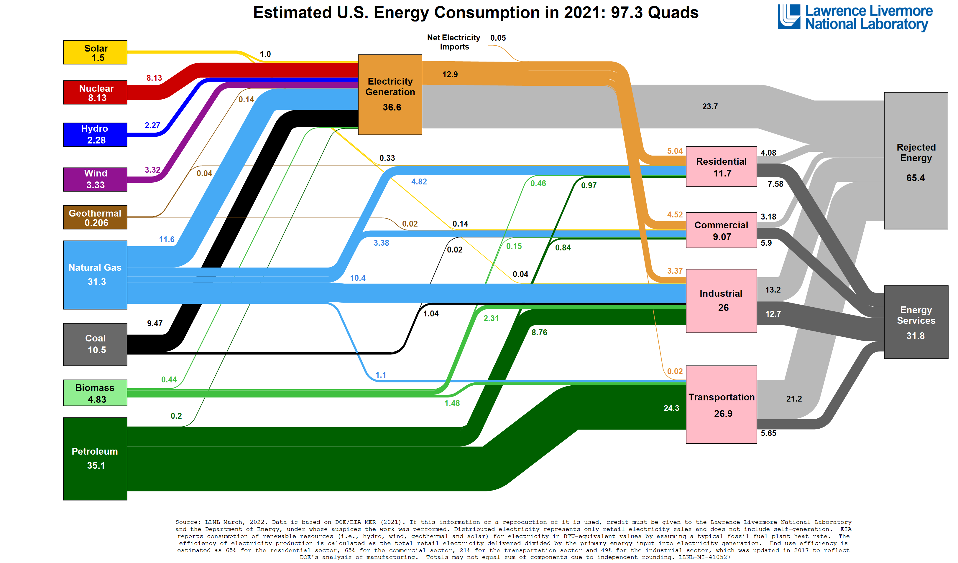
A flow chart from the department of energy representing all of the energy inputs and outputs in the United States in a single year.
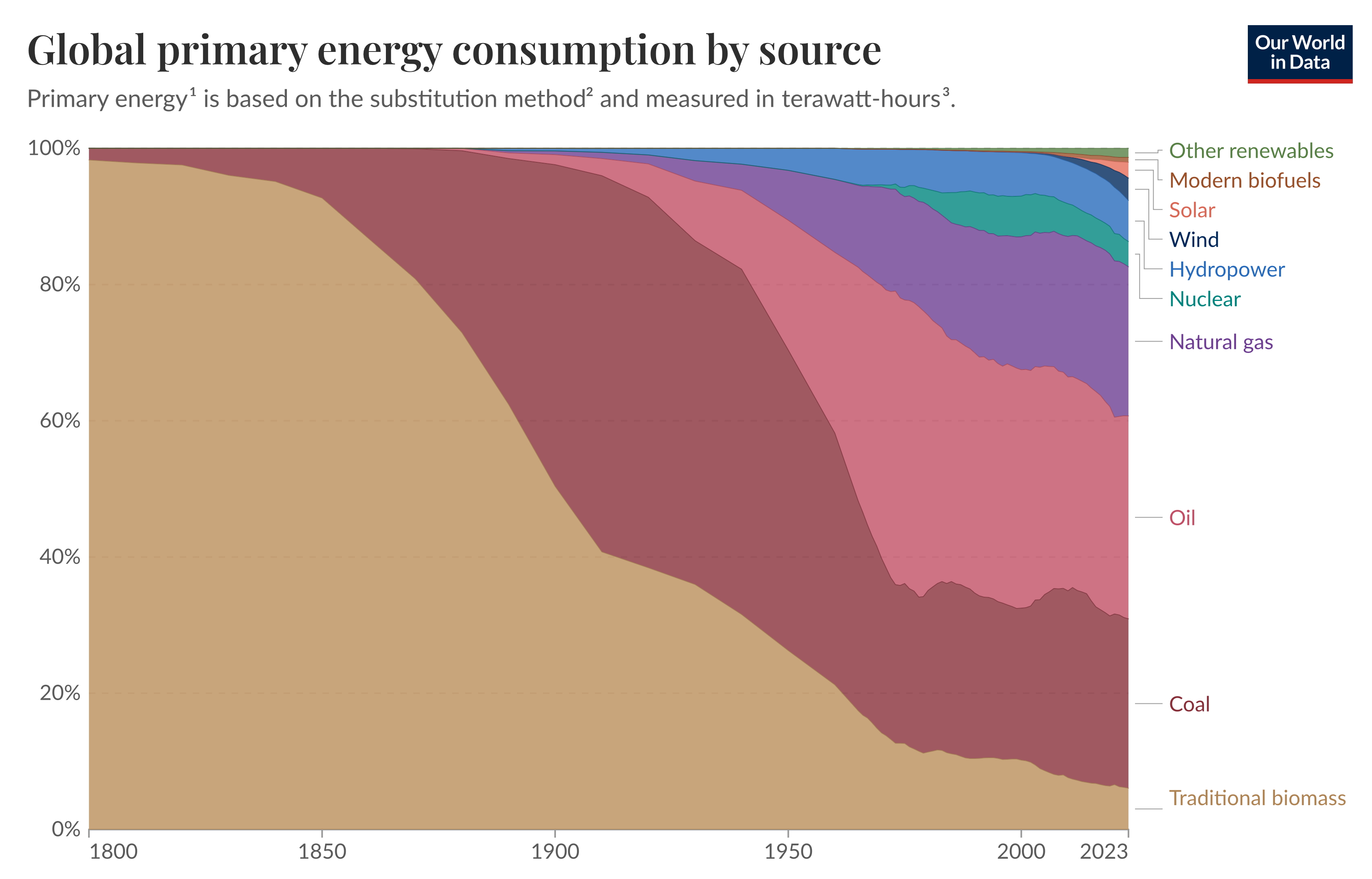
Gloal Energy Consumption by Source
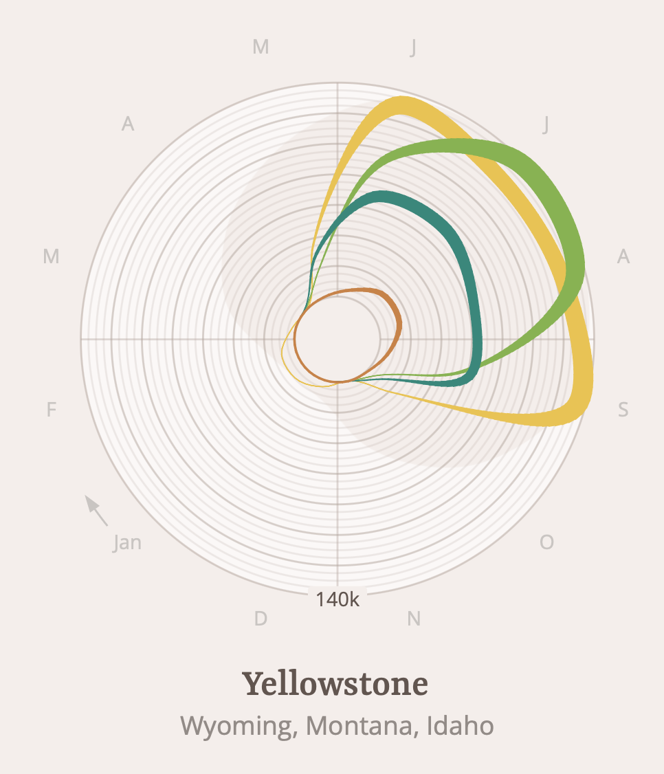
A visualization of the night sky in America's national parks.
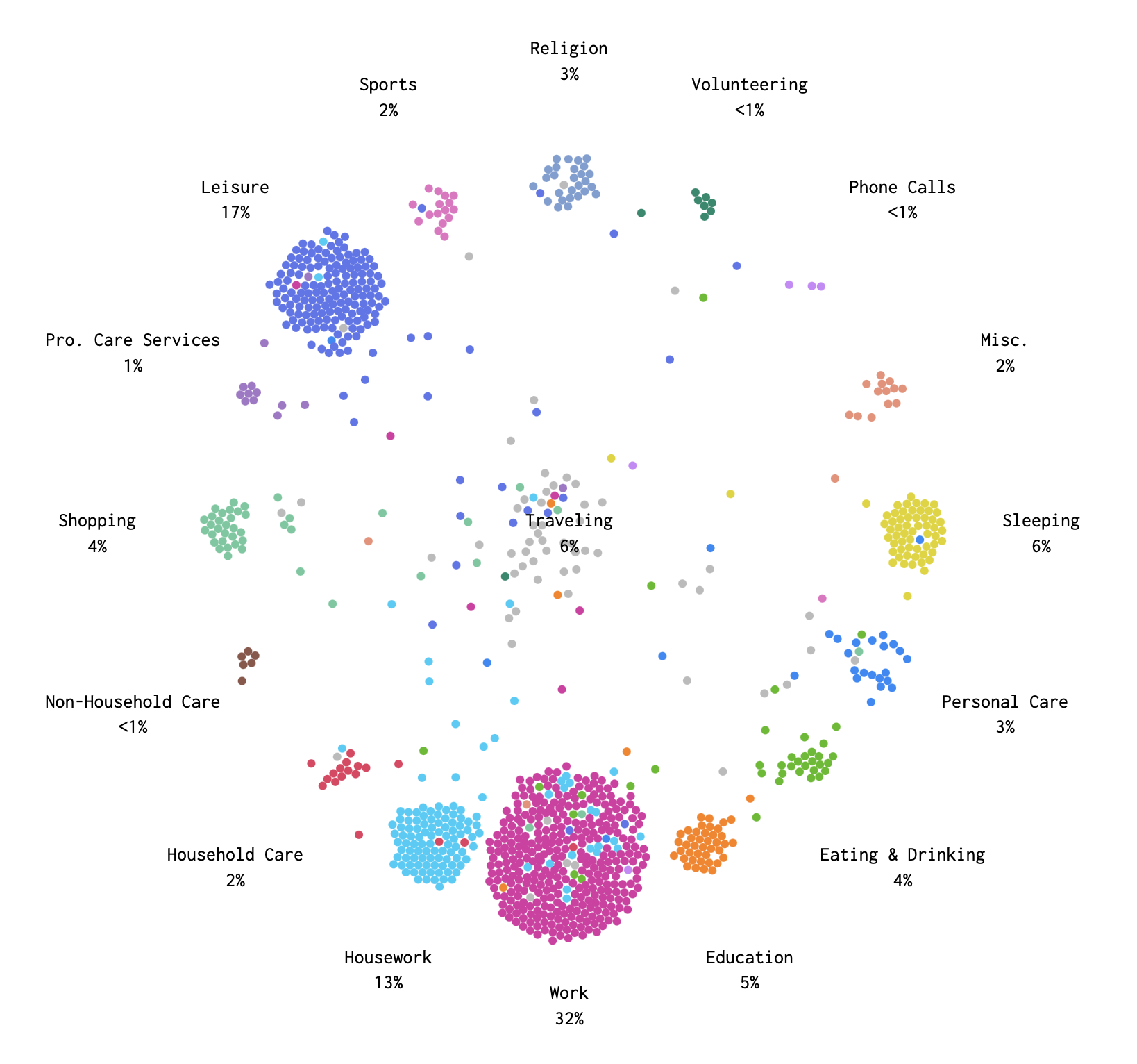
A day in the life of Americans.
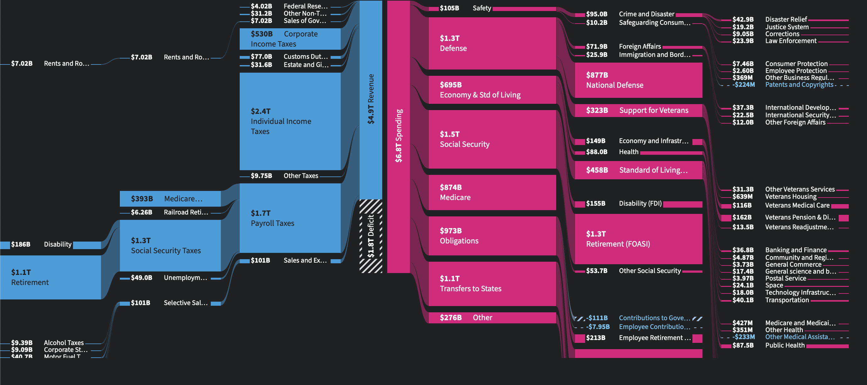
US Government spending. Probably not what you think.
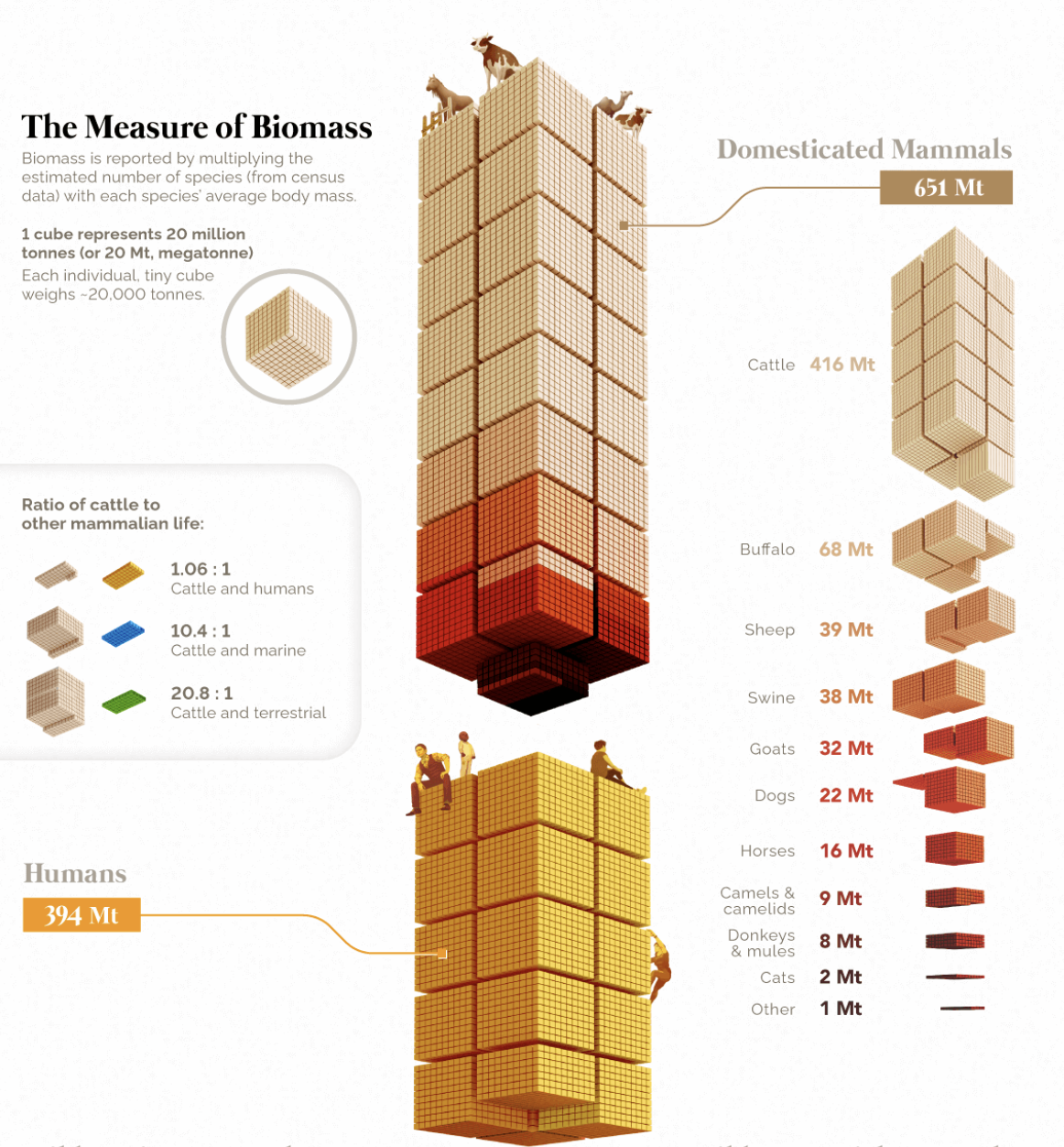
Global biomass of mammalian life on Earth.
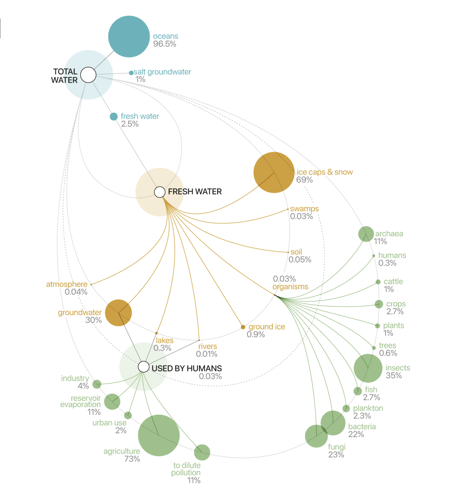
The distribution of all water on Earth.
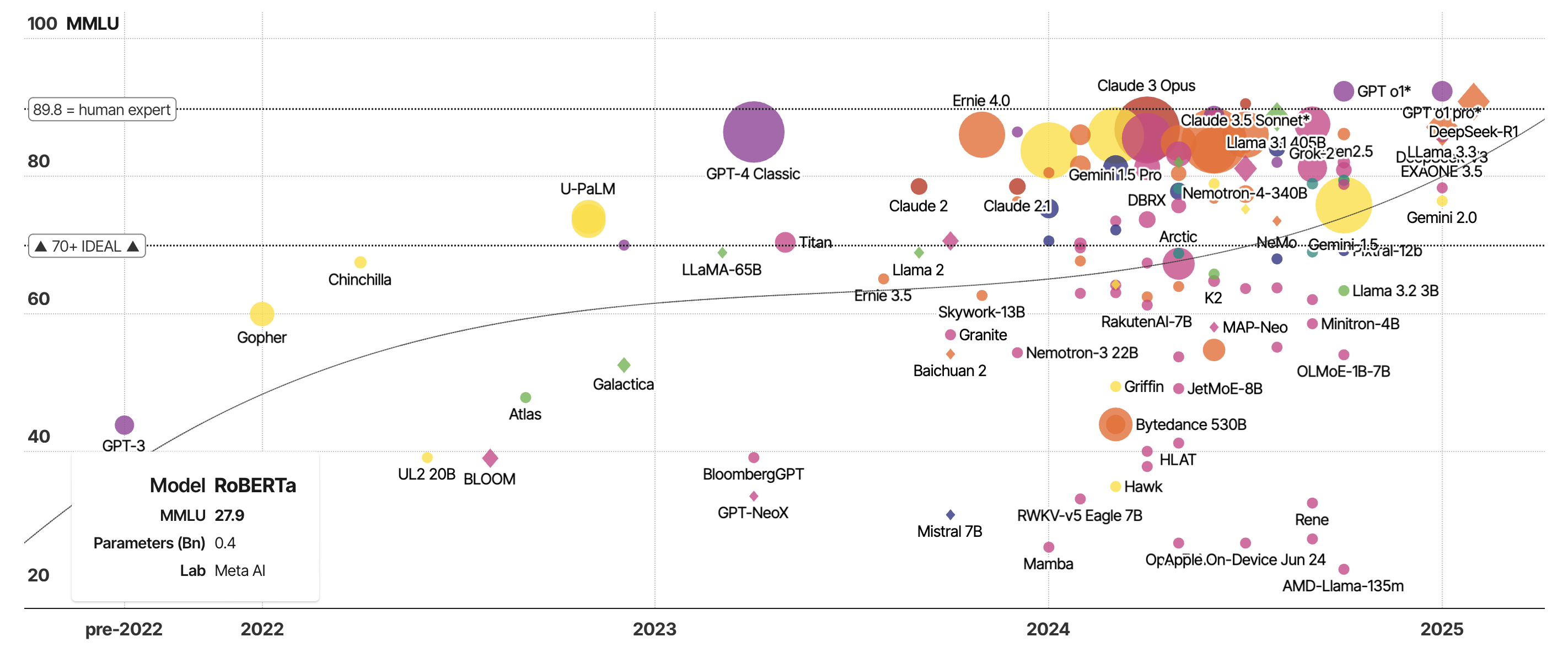
The performance of selected large language models on the MMLU benchmark.
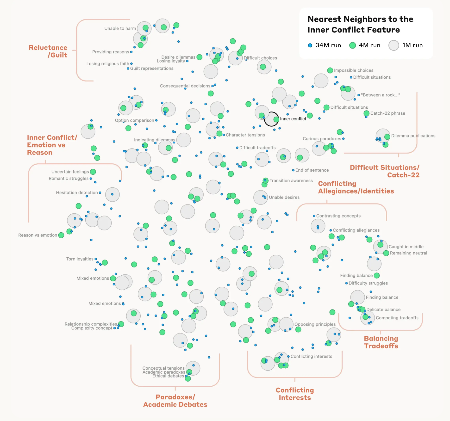
Mapping the Mind of a Large Language Model
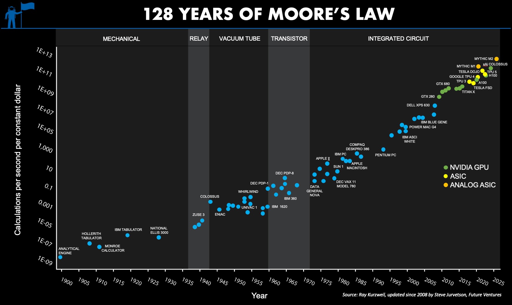
128 Years of Moore's Law
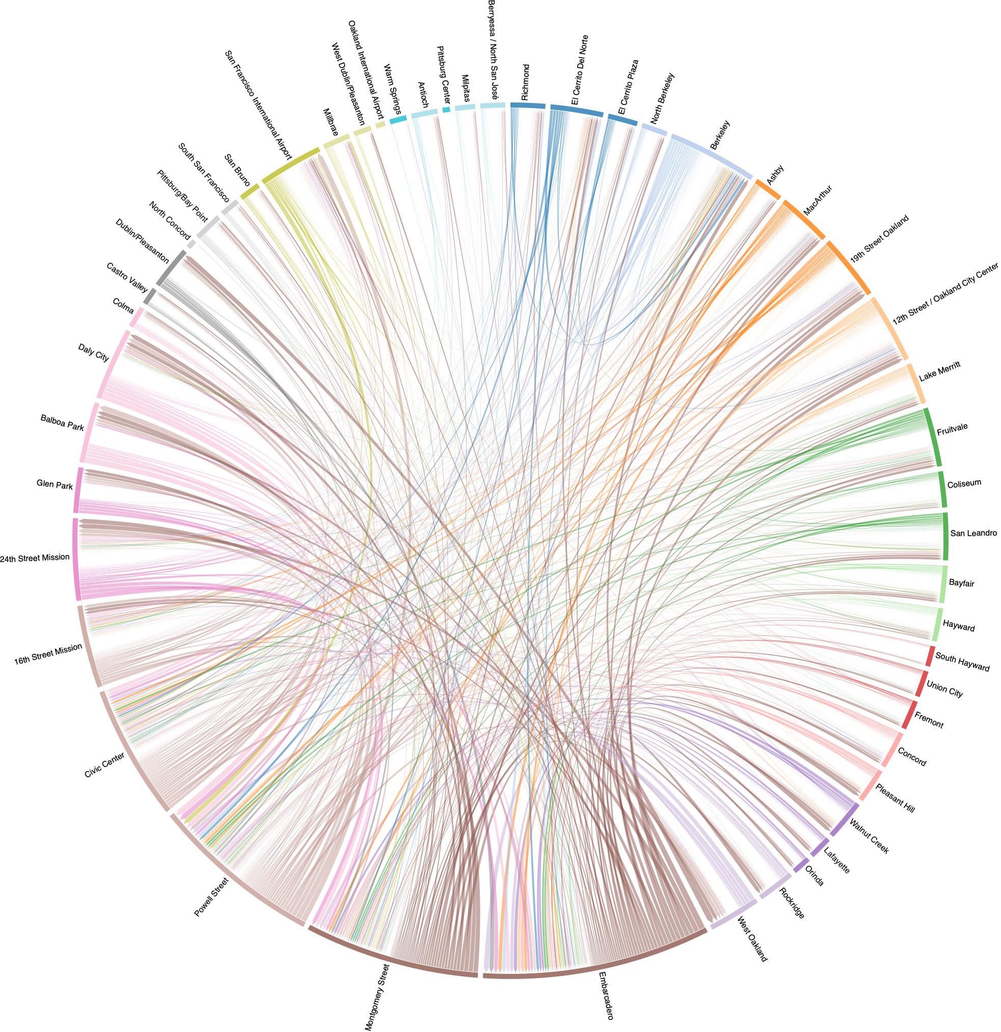
BART Ridership